
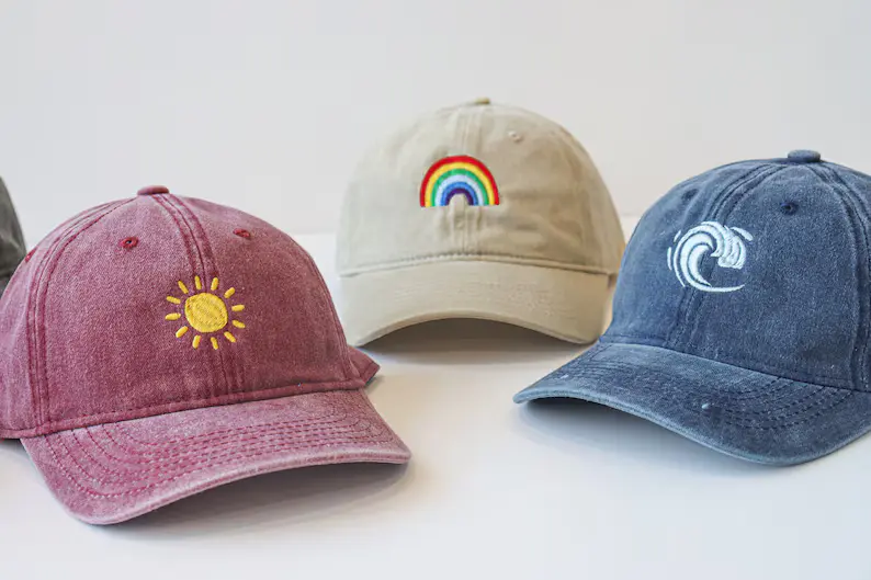
How to Choose the Best Hats for Embroidery
Most people choosing a hat for embroidery focus entirely on the design and barely look at the hat itself. They pick something that looks good on screen, send off the artwork, and then wonder why the final result looks stretched, gappy, or just a bit off compared to the mock-up. The truth is, the blank you start with decides more than the design file ever will.
A hat that embroiders well comes down to fabric, structure, and how the panels are shaped, not just stitch count or thread colour. Once you understand what the hat is actually doing while it’s being stitched, picking the right one stops being guesswork.
Hat Fabric Matters More For Embroidery Than You’d Think
Every fabric behaves differently once a needle starts passing through it hundreds of times. Cotton twill is one of the more forgiving options. It’s dense enough to hold fine detail without the stitches sinking in or pulling loose. Polyester caps tend to be lighter and more weather-resistant, but cheaper blends can be too thin, which leaves embroidery looking flat instead of raised and defined.
Wool blends sit somewhere in between. They’ve got a nice texture and structure, though they can be slightly trickier with very dense designs since the fibres are softer. Foam-front structured caps are a different case altogether. The foam adds thickness and a clean, rounded surface, which actually works in favour of bold logos and lettering.
Many custom hat embroidery buyers pick a fabric purely on how it looks on the rack, without checking how it handles thread tension once stitching begins. A fabric that’s too loose or stretchy can warp under pressure, and that’s usually where puckering and uneven edges come from. Knowing what’s underneath the surface saves a lot of disappointment later.
Where Your Design Will Look Best
Front, side, or back, the placement you choose changes more than just the look. It also affects how well the stitching holds up.
The front panel:
It’s the obvious choice, and it’s where most logos go, but it’s smaller than it looks once you account for the curve. A design that fits perfectly flat on screen can end up cramped or slightly bowed once it’s stitched onto a curved surface, especially on structured caps with a steep front angle.
The sides:
Side placements work well for smaller marks or initials. There’s less curve to fight against, which keeps fine detail intact, though the space is naturally limited.
The back:
This is the trickiest spot. Most caps have an adjustable strap or closure running through that area, so anything placed there needs to be compact and positioned carefully to avoid the stitching landing right on a seam.
Not All Caps Are Built The Same
Picking a hat for embroidery isn’t just about the colour or the brand. The shape and structure change how a design sits once it’s stitched. Across the types of caps and hats available, panel curvature is one of the biggest factors in whether fine detail holds its shape or starts to distort.
Structured caps: These hold a firm, rounded front panel, which gives embroidery a flat, stable surface to work with. Logos and lettering tend to come out crisp because there’s less curve pulling against the stitch lines.
Unstructured caps: Often called dad caps, these have a softer, more relaxed front. They’re comfortable and casual, but the slight dip in the panel means very fine text or tightly packed designs can lose a bit of sharpness.
Trucker caps: With a mesh back and structured front, these offer a similar stitching surface to structured caps, just with less material overall. Good for bold, simple designs rather than anything too detailed.
Flat-brim caps: The flat panel gives a wide, even surface, which works nicely for larger logos or designs that stretch slightly wider than usual.
Bucket hats and beanies: These curve more than caps do, so embroidery placement needs to be smaller and centred. Anything too wide tends to warp around the curve.
What Happens Behind The Stitches
Most people focus entirely on the design and the cap, and completely forget about what’s happening underneath the fabric. Stabiliser backing is what stops stitches from sinking into the material or pulling it out of shape, and it matters more than people realise.
Why backing matters: Without proper backing, even a well-chosen fabric can pucker once the needle starts working through it repeatedly. A thin, flimsy backing might save a bit of cost, but it usually shows in the finished product. The fabric underneath the design ends up slightly warped or uneven, even if the stitching itself looks fine from the front.
Stitch count changes what the fabric needs to do: A simple logo with minimal detail doesn’t put much strain on the fabric. But denser designs, ones with shading, fine text, or layered colours, need a sturdier base to sit on. This is where the fabric choice from earlier comes back into play. A flimsy or stretchy material simply can’t support a high stitch count without distorting.
Getting backing and fabric to match the design properly is what separates a clean finish from one that looks slightly off, even if no one watching can quite say why.
A Few Things to Check Before You Order
Once you’ve settled on the fabric, structure, and placement, there’s still a bit of groundwork worth doing before any order goes through, especially if it’s a bulk run.
Ask for a stitch-out sample first
A photo of the design mock-up never tells the full story. A physical stitch-out shows exactly how the thread sits on that specific fabric, how the colours actually look stitched rather than printed, and whether the detail holds up the way it did on screen. It’s a small step that saves a lot of back-and-forth later.
Check minimum order quantities and turnaround times
Most suppliers have a set MOQ, and it varies a fair bit depending on the cap type and design complexity. Worth confirming this early, along with realistic turnaround times, particularly if there’s a deadline involved.
Get a digitised proof before production starts
This is the file that tells the embroidery machine exactly how to stitch the design, and it’s worth reviewing properly rather than approving it quickly just to keep things moving.
A lot of people looking into custom-made caps in UK only think about price and turnaround, when really, these small checks at the start are what decide whether the final batch looks the way it was meant to.
Why Businesses Keep Choosing Embroidery
Print logos look sharp on day one, but they don’t always stay that way. Embroidery, on the other hand, tends to hold up far longer, which is exactly why so many businesses stick with it for caps and merch.
| Embroidery | ||
| Wash resistance | Holds up well over time | Often fades or cracks |
| Texture | Raised, tactile finish | Flat to the touch |
| Durability | Lasts years with normal wear | Shorter lifespan |
| Look | Feels premium | Can look cheap if it peels |
The raised texture alone gives a cap a more premium feel straight away, something a flat print simply can’t match. And because the thread is woven into the fabric rather than sitting on top of it, there’s no cracking, peeling, or fading after a few washes, which is usually where printed merchandise starts to let a brand down.
For companies handing out caps at events, to staff, or as part of a wider merch line, embroidery ends up being a stylish way to promote your brand long after a printed version would have worn thin, literally and otherwise.
A Few Mistakes Worth Avoiding
Even with the right fabric and structure sorted, a handful of small mistakes tend to show up again and again, and most of them are easy to avoid once you know what to look for.
Going too small with detail: Tiny text or fine linework might look great in a design file, but fabric and thread have limits. Anything too intricate often blurs together once stitched, especially on caps with more curves.
Ignoring colour count: Each thread colour adds time, cost, and complexity. Designs with too many shades can end up looking busy rather than sharp, particularly on smaller placements like the side panel.
Skipping the proof stage: It’s tempting to approve a design quickly just to keep things moving, but a rushed proof is where most placement and sizing issues slip through unnoticed.
Choosing the cap last: The cap should be picked alongside the design, not after it’s finalised. A design built without the fabric or structure in mind rarely translates well once stitching begins.
Quick Questions Before You Decide
What fabric is best for embroidery on caps?
Cotton twill and structured foam-front caps tend to hold detail best, as they offer a dense, stable surface for the needle to work with.
Does cap shape really affect how embroidery looks?
Yes, curved or unstructured panels can slightly distort fine detail, while flatter, structured panels keep designs crisp and well-defined.
Why should I ask for a stitch-out sample before ordering?
A sample shows exactly how the thread sits on that specific fabric, helping catch any issues with detail or colour before a full production run begins.
You Are Now Ready To Order Hats For Embroidery
Choosing a hat for embroidery comes down to a handful of things that genuinely matter: fabric that can hold the design, structure that suits the level of detail, and a sample that confirms it all before committing to a full run.
Skip any of those, and the finished product rarely matches the mock-up. Get them right, and the cap does exactly what it’s meant to, holding the design cleanly through wash after wash, wear after wear.
I am the lead content creator of the CapsCompany.co.uk blog, which provides valuable insights into the craftsmanship and behind-the-scenes processes of custom headwear.My posts go deep into covering the quality of the embroidery, the cap, the branding, and the promotional merchandise. I would like to demonstrate to companies the power of custom cap design in enhancing brand awareness and establishing relationships with customers.